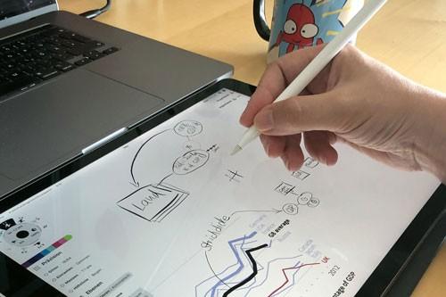
Learn how to turn your users into real fans with impactful data visualizations
A 12 weeks bootcamp to help your team create data products that people can’t live without.
Is this you?
Nobody uses your data product
"Just show me all the data!" that's what your users said. So, you built them an analytics app ... that hardly anyone uses. Engagement rates are horribly low, although you have implemented every feature request.
Untapped potential
You know there’s huge potential to create data visualizations that can be a game-changer in your business. BUT, your techies and designers don't have a common language, and the data visualization books you’ve found so far are too basic, too general, and not suited for your special situation.
Confusion & trust issues
Your data product uses machine learning to solve complex problems. Unfortunately, nobody is buying it because of how difficult it is to understand it. Also, your customer service team spends way too much time answering questions because users do not trust the predictions.
Iconic Data Design
An online data visualization bootcamp
Master the power of human-centered data analytics. Create dashboards that show real value for your customers.
As data visualization is a team sport, this course is perfect for a product team with product leaders, UX designers, data scientists, data analysts, and software developers.
By the end of this 12 weeks training, you (and your team) will be able to
- assess the quality of any data analytics solution and identify weaknesses
- develop effective solutions for those weaknesses
- apply the step-by-step design strategy for data visualizations
- create data visualizations that solve a user's problem and enable actionable insights
- choose the right chart types for dashboards and data products
- choose from hundreds of visualization options the ones that are optimal for your users.
- creatively develop custom charts that are perfect for your situation.
- identify how your data products can be misused and what to do about it.
-
speak a common data analytics language - techies and designers alike
-
prepare a data prototype for user feedback interviews.
Iconic Data Design Content
12 hours video lessons & 12 hours individual coaching

It has been an epiphany
"Interviews are something we never took the time to do - also we didn't want to disturb people. We thought that we already knew the answers - but our experience in this bootcamp showed that it is not the case.
Understanding what the users need is not that straightforward at all. Going through the interview preparation process and conducting actual interviews has been an epiphany - it changed everything.
Even more astonishing was it to see how different the user perspectives are - even within the same group. This bootcamp was a huge success. We learned quite a lot from it - it's not abstract, but very practical and hands-on.
Our project’s end result is vastly superior to the dashboard we had before, and the team is much more mature now."
Jivan Roquet
Data Science Manager at Kpler, London
Pssst ... Want to see what's exactly in this course?
Hi, I'm Evelyn! Let me show you 3 milestones that are absolutely vital to a successful data product launch – PLUS get a glimpse of everything you'll learn in the Iconic Data Design Course!
Is this bootcamp for you? Let’s find out
The Iconic Data Design Bootcamp solves a lot of problems, but it’s still not for everyone. That's why we offer you two ways to find out if you and this course are a good fit:
Book a free call
That's the fast lane. We will have an in-depth chat via Zoom to discuss if this training is a good fit for you, your company, and your team.
During our call, we’ll get you on a clear path to overcome your biggest data design challenges.
Get invited to the next info event
Get access to our upcoming webinar where you will get
- details about prerequisites for this bootcamp - does it make sense in your situation?
- A preview of the course content.

It’s hard to believe that we didn’t use the Data Questions before
"Iconic Data Design completely changed the conversations with our users.
Now we talk about their problems and use cases instead of KPI definitions and data.
This enables my team to easily design dashboards that actually get used, while providing a great user experience."
Renske Prins
Team Lead Global Analytics, Celonis SE, Munich
The Chart Doktor
Data Design Strategy
So, what are the three must-have steps every successful data product team follows to turn users into fans, without spending months on user testing?
(Hint: I've seen many teams skip step 1, never really talk about step 2, and go directly into step 3. Sadly, this never works.)
The Why
Ask yourself: why should the product be built?
Get crystal clear on:
- Business goals
- Processes & eco system
- User problems
- Data questions
The What
What data and information should appear in the product?
Get crystal clear on:
- Data answers
- User's mental models
- Data quality
The How
How can the data be visualized?
- Dashboard architecture and chart types
- Visual language
- Color strategy
- Marks, units, axes, legends
Let me walk you through how this works

Game plan session
Before the program starts, we will have an onboarding session where we get to know each other, set a clear goal and vision, choose a data visualization project that is suitable for hands-on exercises, and define our weekly workflow and dates.

12 week lesson plan
The three steps of the Data Design Strategy are laid out in 12 modules. Each week, you get access to a new module, consisting of a lesson, an assignment and a coaching session. The lessons contain deep knowledge that you will not find in other places.

Work on your own project
You learn a lot better when you have the chance to put theory into practice. That's why my weekly assignments not only include quizzes and examples, but you get to work on your own exercise project - YES, a project of your own choosing, that is specific to your business.

Weekly coaching
Each week your team gets a 1:1 coaching session where we review your homework, maybe sketch some more design ideas, and dig deeper into special topics that are most relevant to your business and your data products.
FAQ
How will the program be delivered?
Is this more about data visualization or UX design?
Why is it just for teams? How can I as an individual book this program?
What is a suitable exercise project?
What is the maximum number of team members?
What data visualization tools are used?
Our project is urgent. Can we go faster?
How much time do we need to set aside?
Evelyn Münster
I am a data analyst, storyteller & visualization expert specialized in data products. I create user centered data visualizations that enable actionable insights and that explain complex things in a way that the audience understands them easily. My projects are in a wide range of fields, from data science, machine learning, robots and analytics to code, statistics, processes and user journeys.
With a background in media art, software development and data analytics, I'm in the visualization game since 2008, helping technology clients from many industries develop complex and innovative data products, such as control and decision systems, tools and dashboards.
I am pleased that my Cycle of Encoding and Decoding has been included in the study “Future Skills: A Framework for Data Literacy” by the Hochschulforum Digitalisierung. My work serves as the basis for the framework for data literacy developed there. This framework sets the direction of education at German universities.
I am living in Nuremberg and Munich, Germany.
Want to take a look at my work? Here is my portfolio.

Learn what I have learned the hard way for the last 12 years.
I've spent my career working in the trenches for global tech and AI companies, building B2B data products.
At the beginning the dashboards that I designed where tedious to sell and afterwards almost nobody used them!
Although I had implemented all the requirements and user requests. I was devastated. 😭
But then I slowly figured out more and more strategies that helped me build better data visualizations.
- How to deeply understand the user's needs (although the users themselves can not articulate them).
- How to select data views that match the user's needs.
- How find out what kind of explanations are needed without endless user feedback iterations.
By putting those strategies to work in my client's projects, I continuously achieved better and better results. Also I figured out those nitty gritty details in hundreds of different data situations, so I can already foresee what will work and what won't.
Now it is my mission to share all this knowledge with you and all the data product teams out there, to make the world a little bit better. 🎉
Is this bootcamp for you? Let’s find out
The Iconic Data Design Bootcamp solves a lot of problems, but it’s still not for everyone. That's why we offer you two ways to find out if you and this course are a good fit:
Book a free call
That's the fast lane. We will have an in-depth chat via Zoom to discuss if this training is a good fit for you, your company, and your team.
During our call, we’ll get you on a clear path to overcome your biggest data design challenges.
Get invited to the next info event
Get access to our upcoming webinar where you will get
- details about prerequisites for this bootcamp - does it make sense in your situation?
- A preview of the course content.


